Corporate Sales Deck Redesign for Swiss Pet Solution’s B2B Outreach
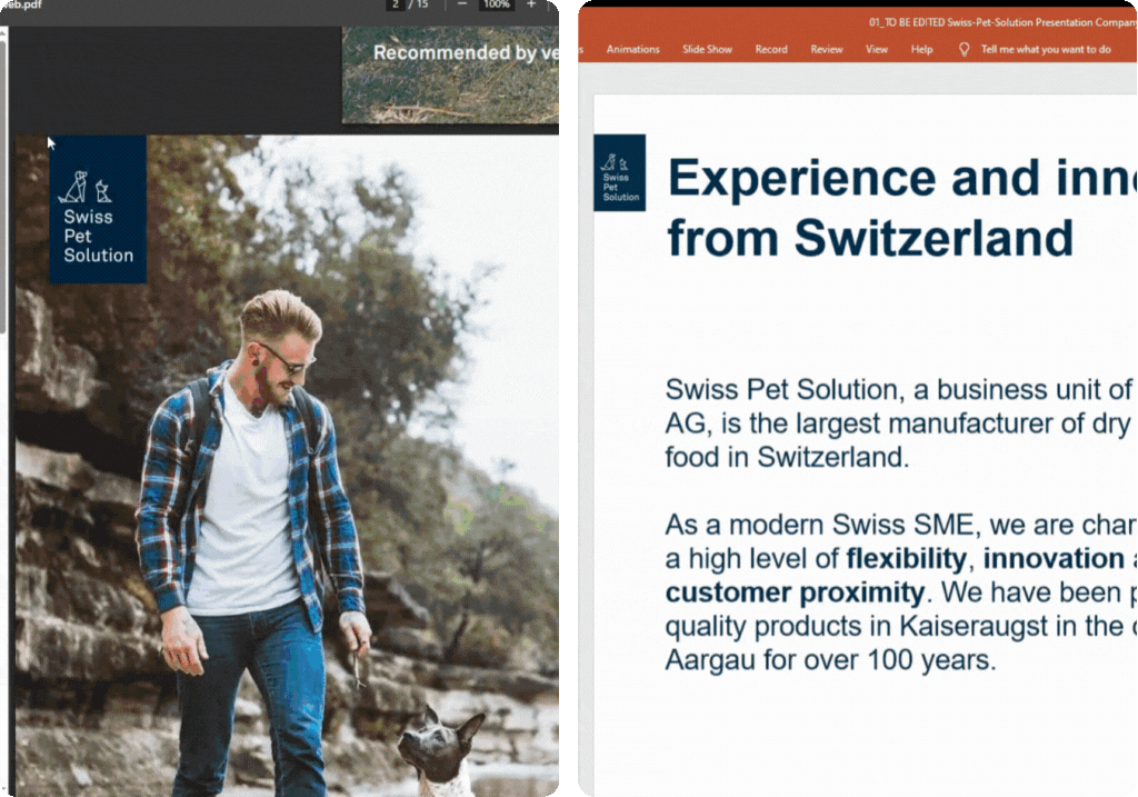
Redesigned a strategic B2B presentation to attract global wholesalers, distributors, and partners.

Project Highlights

Swiss Pet Solution (a business unit of Granovit AG) needed a compelling sales deck to present their product range and manufacturing services to global wholesalers and distributors. My role was to elevate the content and build a visually polished, sales-ready deck aligned with their Swiss branding.

  • 🧠 Designed the deck for use by the sales team in outreach to distributors, wholesalers, and partners
  • 🎯 Turned a rough internal presentation into a polished, B2B-ready sales deck
  • 📝 Rewrote translated copy to sound more natural and professional in English

About the Client

Swiss Pet Solution is a premium dry pet food manufacturer based in Switzerland and a business unit of Granovit AG. With 100+ years of expertise, they serve domestic animals, zoo partners, and the equestrian sector through high-quality, GMO-free, Swiss-made products, supported by cutting-edge in-house labs and sustainable operations.

Challenge & Scope

Swiss Pet Solution had solid content, but the presentation wasn’t visually structured and the copy needed improvement for an English-speaking audience. It lacked a structured layout, and much of the copy felt awkward or unclear due to literal translation from Swiss German.

The scope involved:

  • 📝 Refining translated copy for clarity and native-level English
  • 📦 Translating the catalog’s visual style into clean PowerPoint layouts
  • 🐾 Highlighting product categories: dogs, cats, zoo animals, and equestrian
  • 📊 Showcasing Swiss quality, certifications, and private label capabilities
  • 📁 Delivering a fully editable, on-brand B2B deck for sales team use

What I Received

To kick things off, the team shared an internal PowerPoint draft with all the core content laid out, plus a branded template they’d used before. It wasn’t quite presentation-ready, but it gave me a solid sense of how they’d been structuring things internally.

They also had a product catalog already in use, which had a more polished visual feel. I used that as a reference point for the overall design direction—pulling from its layout style, color usage, and tone. Since there wasn’t a formal brand guide, I did a bit of digging on their website and social media to get a better feel for how they show up visually and communicate as a brand.

  • 📄 Internal PowerPoint draft with complete slide content
  • 🧱 Corporate-branded template for font and general structure
  • 📘 Product catalog used as the main visual reference
  • 🌐 Website and social channels for tone, color, and layout cues

My Approach

It wasn’t just about cleaning up the slides, it was about making the content actually work for a real audience. Most of the original text had been translated from Swiss German, and while the ideas were great, the messaging felt stiff and a little off in English. I restructured the flow, smoothed out the language, and made sure everything felt cohesive and professional.

They already had a well-designed catalog in place, so I used that as the visual foundation, carrying over its tone, spacing, and color rhythm into the slides. From there, I restructured the content into a clearer, more story-driven flow that would resonate better with a B2B audience.

Here’s how I tackled it:

  • 🧭 Reorganized the slides to follow a more natural, easy-to-follow narrative
  • 📝 Cleaned up the translated copy so it sounded fluent and confident in English
  • 🎨 Built the layout around their existing catalog style to stay visually consistent
  • 🐾 Grouped the content by product category to make it more intuitive for distributors and partners

Before vs After

When I first opened the deck, I could see they had everything they needed—the content was there, the messaging made sense, and their product breakdowns were clear. But the way it was presented felt heavy and hard to follow. It just needed structure, clarity, and a stronger visual direction to really land in a sales conversation. My goal was to clean it up, make it feel more cohesive, and turn it into something their team would feel proud to present.

Before Image After Image
Tap to view before & after
Viewing: Before
✅ What Stayed the Same (And Worked!)

The original structure worked, so I didn’t change much there. The product categories and Swiss messaging were already clear—they just needed to be framed better.

  • Kept their original product segmentation and overall slide flow
  • Preserved key messaging around Swiss-made quality and private label offerings
  • Worked with the content they had—just restructured it to be more digestible

Most of the content was translated from Swiss German, and while the ideas were strong, the language often felt stiff or too formal. I rewrote it to sound more natural and confident for an international sales audience. I also aligned the visuals with their existing catalog for consistency.

  • Matched layout and styling to their existing product catalog
  • Rewrote translated copy for clearer, native-level English
  • Adjusted spacing and flow to improve readability across slides
  • Standardized logo placement—company logo on the top left, Swiss badge on the top right, all in consistent sizes

The visuals needed the most attention. The client had sent over a batch of stock images, but many didn’t quite match what each slide was trying to communicate. I swapped in more fitting photos—some from their collection, some I sourced myself. Most of their original images featured pets with brown or warm-toned fur, so I leaned into that and used warm, earthy tones throughout the deck.

They also had clashing brand colors (Granovit’s green and Swiss Pet’s blue) which made the slides feel a bit disjointed. I leaned fully into Swiss Pet Solution’s branding for a cleaner, more unified look.

  • Swapped in better-fitting photos to support each slide’s message
  • Applied warm, earthy tones inspired by their original image selection
  • Removed branding clashes by simplifying the color palette to align with Swiss Pet Solution’s blue
  • Added icons and layout dividers to guide the viewer through the content more intuitively

The Outcome

The final deck is now a central part of Swiss Pet Solution’s global sales toolkit. It reflects their credibility, Swiss-made quality, and deep product expertise, now presented in a format that resonates with English-speaking distributors and partners. With native-level messaging and clean visuals, the sales team can confidently present in any market setting.

Client Feedback

Thank you again for your great work! You helped us a lot to get back to a clean presentation.
The project is now at Sales and then we will do the finishing touches internally.

Sandra Katz
Head of Marketing & Communications, Granovit AG (Swiss Pet Solution)

You May Also Be Interested In